Overview
This article details how to create a guide in the Visual Design Studio. This includes highlighting new features, driving preferred behavior, and providing in-context support.
Create Guide
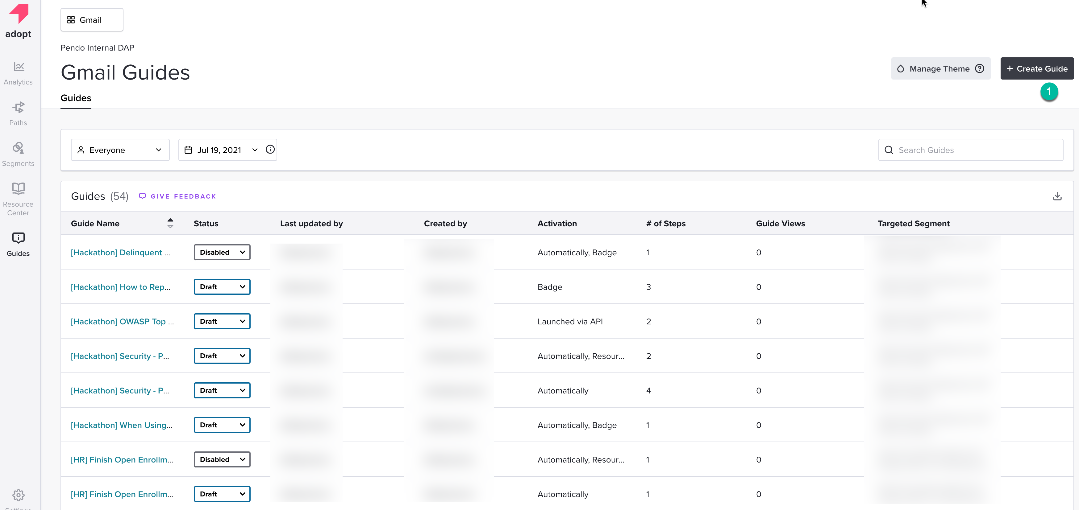
Begin by clicking the Guides icon in the left hand navigation menu. Then click “Create Guide” (1) button in the top right corner to begin.
You will then be prompted to select a guide layout. There are several to choose from. Select the one that best fits your specific use case.
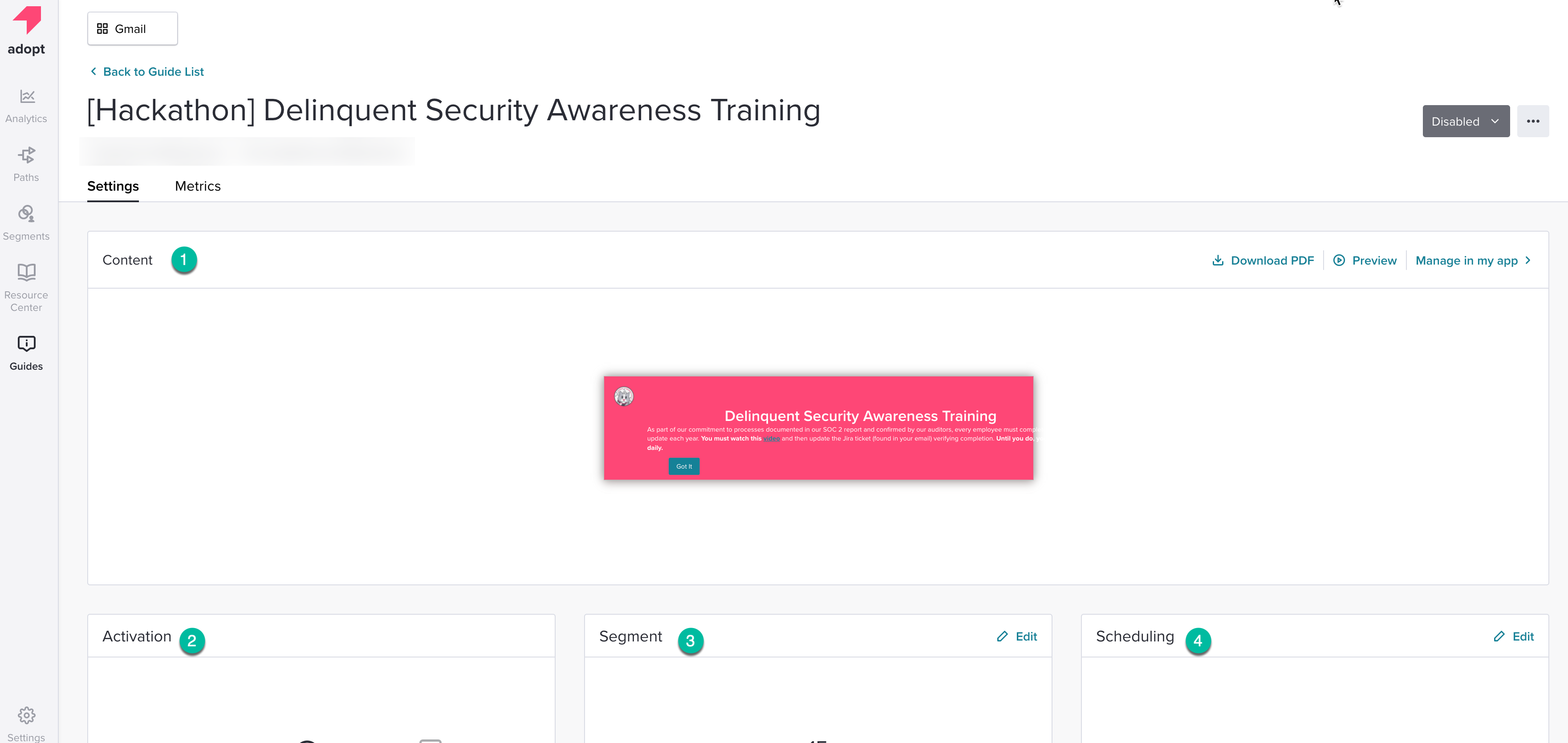
Once you select your guide layout, you’ll be presented with the Guide Settings page. Here you’ll be able to manage your Content (1), Activation (2), Segments (3), and Scheduling (4). You can rename your guide and begin editing the settings.
Guide Content
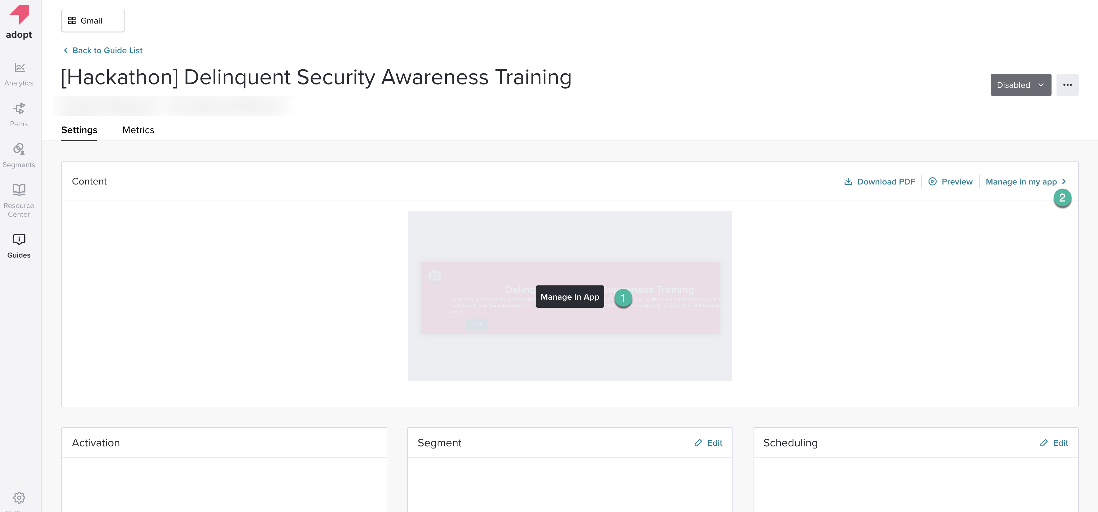
To edit your Guide content, you may hover over the guide image and click the “Manage in App” dialogue box that appears (1), or click on the "Manage in my app" button in the top right corner of the Content widget (2).
Next, you’ll be asked to provide the URL of where you’d like to see your guide. Upon clicking “Launch Visual Design Studio” you’ll be opened to a new tab with the Visual Design Studio on your application.
After logging into your product, the Visual Design Studio will load over the product URL you specified.
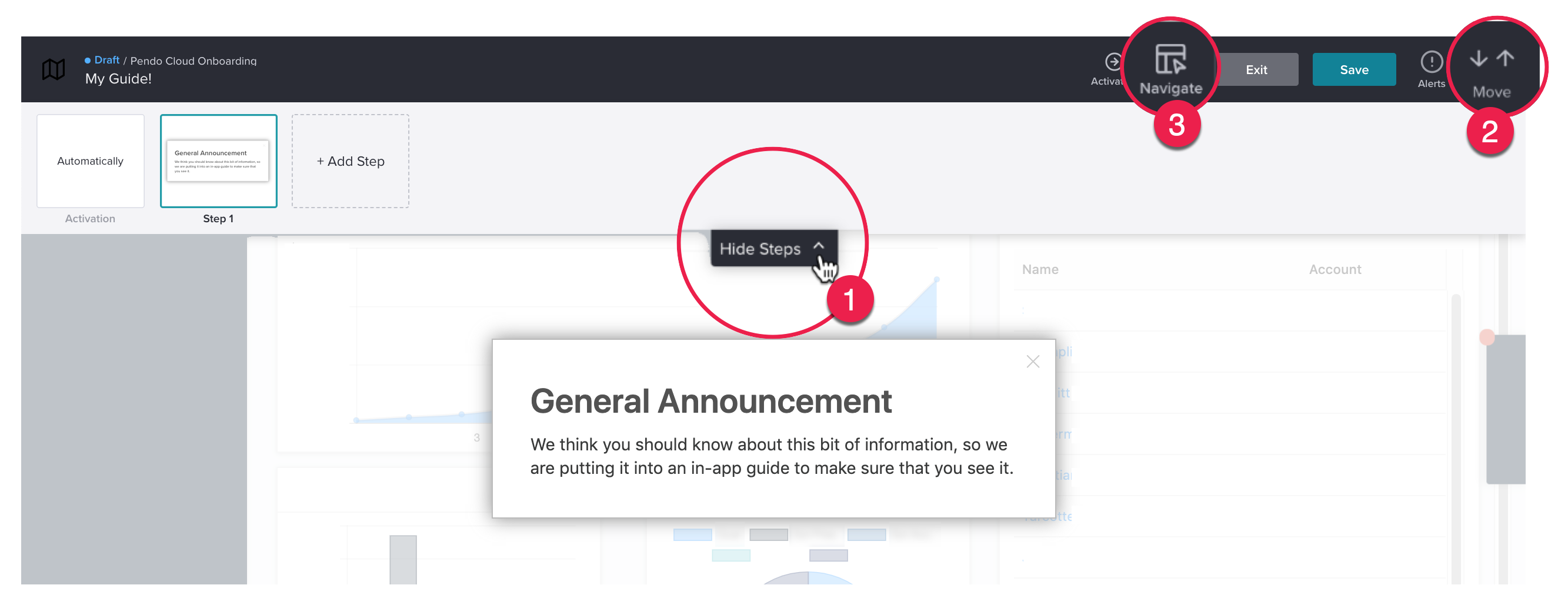
Once the designer loads, be sure to open the "Step Tray" (1) so you can see all your activation options and Guide steps. If you wish to target an element but the "Action Bar" is covering it, move it to the bottom of the screen by clicking on the dual arrows button (2) in the top right-hand corner of your screen. To navigate to another page in your application, select the "Navigate" button (3).
Editing A Guide
You can make any initial edits to your Guide within the “Edit Container” box. Once you click “Apply,” you will be able to hover over the placeholder items within the Guide Preview and click to edit. If you need to add a new building block to your Guide, hover between items to see the blue line and add your desired building block.

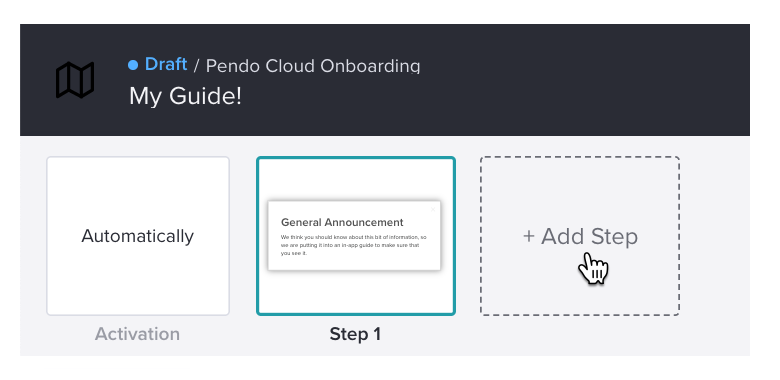
Want to add a step in your Guide? Click on the "+ Add Step" option in the Step Tray so you can add a new step without having to start over.
Editing Guide Settings
Once you’re satisfied with your Guide (one or all Guide steps), hover over a Guide Container (the edge of the Guide) in a step to edit it’s settings:

The Styling (1), Location (2) and Behavior (3) options will display after you click the edge of Guide container for additional customization:
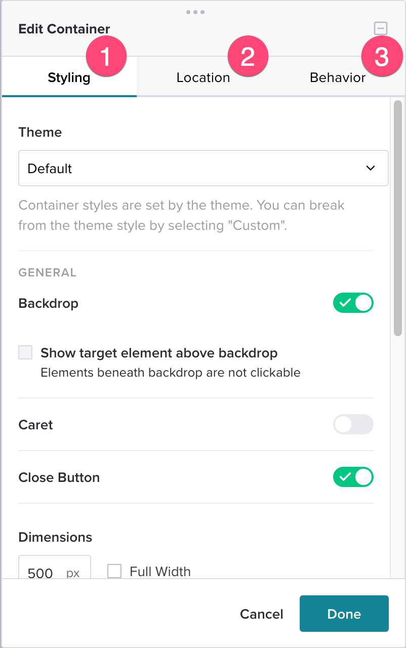
- Styling (1) - This is an opportunity to select a theme for your Guide. When "Backdrop" is toggled it shows the Guide above a backdrop. When "Caret" is toggled it adds a caret to the top left corner of the rectangular guide. Toggling the "Close Button" either adds or remove a close button to the top right hand side of the guide. You also have the ability to configure ARIA accessible names to the Guide and autofocus the step so it becomes the first step that is read by a screen reader.
- Location (2) - The "Position On Page" drop down allows you to change the positioning of the guide. There are several options: Top Left Aligned, Top Aligned, Top Right Aligned, Left Centered, Centered, Right Aligned, Bottom Left Aligned, Bottom Aligned, Bottom Right Aligned, Relative To Element. The "Position To Element" drop down allows you to configure the positioning of the Caret.
- Behavior (3) - This is the section that allows you to configure the actions that you want your user to take after encountering the guide. The two options are either "Advance on Element Hover" or "Advance on Element Click".
Guide Activation
Lastly, make sure you are using the Guide Activation (1) method you want in the Action Bar:

Clicking on the Activation tile in the tray or the button in the Action Bar will allow you to edit your Activation method. You will have three options:
- Automatic (1): Guide appears once automatically until dismissed or advanced.
- Badge (2): Guide appears after a visitor clicks or hovers over a badge icon.
- Target Element (3): Guide appears after a visitor clicks on a targeted element.
You can choose just one, or apply both Automatic + Badge or Automatic + Target Element. You cannot choose Badge + Target Element. For more information, see the Guide Activation Options article.
Once you are finished, save your changes using the “Save” button and click “Exit” to leave the designer.
Test
To test your Guide, create a segment that includes your visitor only. Then, set the guide to display to this segment.
Locate the “Segment” tile in the Guide Details Page and click the “Edit” icon. Then, choose the dropdown to select “Custom Segment.” Here, you will add a segment rule so that “Visitor ID” equals yourself.
For example, if my Visitor ID is my email address, my rule would look like this:

pendo.getVisitorId(). 
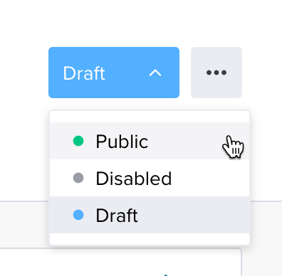
Once you’re done, choose “Save Segment” and then click “Save” within the Segment tile. Review your Guide details and update your Guide status to “Public.” Since the Guide is segmented to just yourself, the Guide will only be visible to you.
Clear Guide Data
Automatic guides only display for visitors which have no dismissal event for the guide. A dismissal event occurs, typically, when selecting the top right X in any of the steps. When testing your guides, you may want to see these guides multiple times. To do this, you will need to clear the guide data. This will reset all of the collected guide data. You can use this option to have the guide appear again to users who have previously seen and dismissed it.
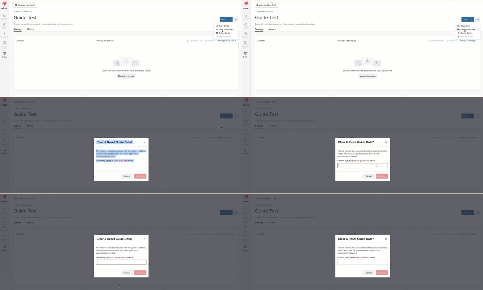
On any guide details page, click the three dots next to the Guide Status and select "Clear Guide History." You will be prompted to input "clear-guide-data" as an extra precaution.
Note that users can only ‘Clear Guide Data’ if the guide is in Draft.
Tip: It is good practice to clear guide data after testing and before your final public lunch so you don't have test metrics skewing your data.
Launch
If you’re satisfied with your Guide, re-adjust the segment to the correct audience.
To publish your Guide, you have two options to choose from:
- Publish your Guide now by updating the Guide status to Public.
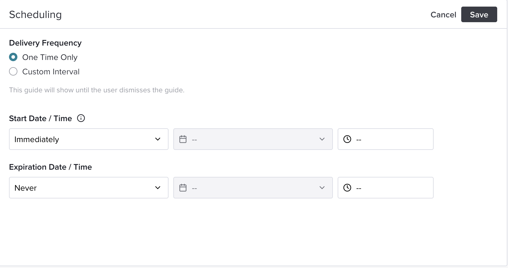
- Schedule when your Guide will go live (and, if needed, when it will no longer be active).
Export Guide Steps To A PDF
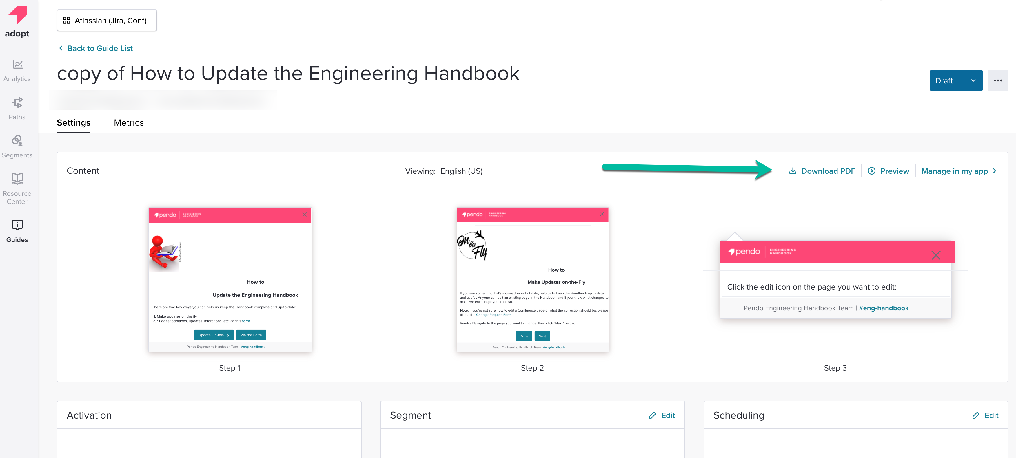
In the Guide List tab, select a Guide. You will then land on the Guide Settings page.
From here, click on the "Download PDF" button next to the Preview button. Once the button is clicked you will receive a PDF file containing all the steps in the Guide you've configured.
